Sign in to continue
I much prefer the dark background, but then i have changed it in my setting to dark.
To be honest, the look and feel of the site is fine, we need activity. Even if it is just copy and pasting news from other sites to start discussion here. We seem to go from one week to the next and not talk about wrestling, which is weird on a wrestling site.

It looks fine, but not great. Looking great will help make people want to sign up when they come to the boards. I also have a lot of background work to do to help the forums do well with search engines which will hopefully get some new members here which will hopefully help bring back some more discussion. It's a project I'm working on to improve the boards overall.

The light background looks horrible. I can't stand it. The dark one I use all the time, and it's much better.

Thanks Taker_2004 for the banner!

I use the dark background too, but I think we should keep the option for a light background, if possible (a typical third way, sitting on the fence answer 😋 ). It's nice to have the choice for those that prefer something different!
I also like the Chris Jericho graphic at the top, it's pretty cool, though I do think he might be a bit lonely! Could we have more guys up there, like Punk and Bryan (we are part of the IWC afterall)? Or maybe a different one every time we go to a new page?
Original 4w Sign-up Date: 03/02/2004
Winner: 4w Draft V3.1
Slammy: Nicest Poster ‘08 & Poster of the Month: Nov ‘10
4CW: 2x Hall of Famer, World Champion, 2x Tag Team Champion & War Match Winner ‘08 & ‘19
Will still have two options. Just have to build one first as the default, the one people will see when not logged in.
I did think about having multiple headers. Something I will be looking into.
It looks fine, but not great. Looking great will help make people want to sign up when they come to the boards. I also have a lot of background work to do to help the forums do well with search engines which will hopefully get some new members here which will hopefully help bring back some more discussion. It's a project I'm working on to improve the boards overall.
Most people lurk before signing up. I know I did before joining 4w 9 years and 11 months ago. A dark background will have about a 10% affect on a potential new member. Seeing activity and interesting posts will make up 60% and luck the final 30% (guesswork on my part, but I'm a genius so I'm prob right...)
But if you want to play with the colours, then cool. As long as I can keep the one I have then Im happy.
A sneak peak at what I've been working on. Got a lot of work to do still as not been able to do anything over the holidays and sadly I have to go back to work tomorrow. Things will change from these views as they aren't complete yet, but it's a start.
Real question though is if someone wants to do a proper design of the 4cw part 🙂
When not logged in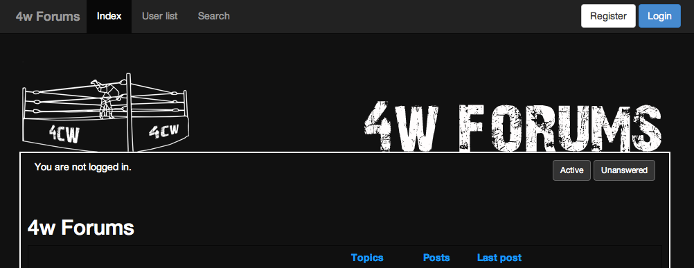
When logged in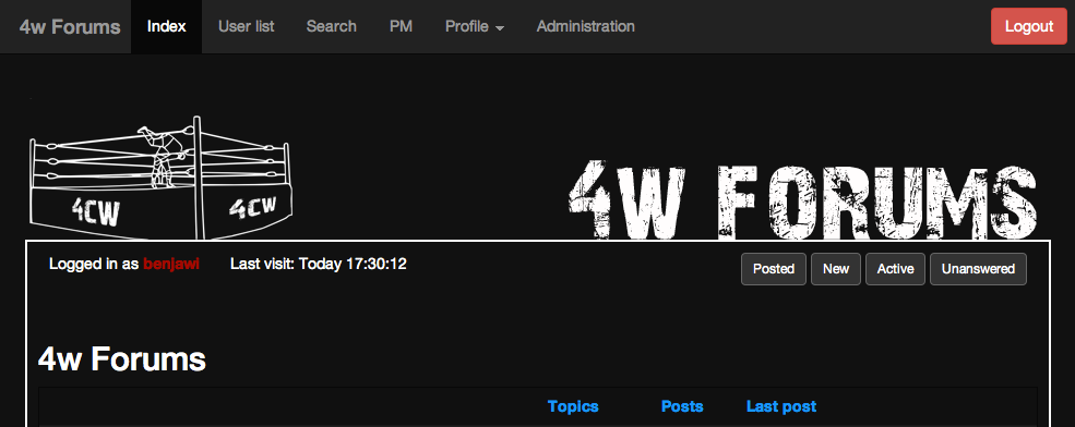
The profile section has a drop down to select the part section you want instantly, so it's q bit quicker to update your signature.
All fully mobile friendly as well, will look a lot better on a mobile than the site currently does (even though it's not bad on a mobile).
A sneak peak at what I've been working on. Got a lot of work to do still as not been able to do anything over the holidays and sadly I have to go back to work tomorrow. Things will change from these views as they aren't complete yet, but it's a start.
Real question though is if someone wants to do a proper design of the 4cw part 🙂
When not logged in
http://i218.photobucket.com/albums/cc24 … 3bbdaf.pngWhen logged in
http://i218.photobucket.com/albums/cc24 … aa14b0.png
The profile section has a drop down to select the part section you want instantly, so it's q bit quicker to update your signature.All fully mobile friendly as well, will look a lot better on a mobile than the site currently does (even though it's not bad on a mobile).
I like it, looks good Benny.
Looks great. Im sure I could make a 4cw banner but my talents are limited.
Thanks Taker_2004 for the banner!

that looks awesome man
Former 4CW Champion
4CW Hall of Fame Class of 2019
4CW 2019: Champion/Wrestler/Moment
Okay, so the idea above has stopped for the time being as it involves a lot of changes to the code, which I just don't have the time for at the moment. Instead what I've been dong is working on a new theme. It's available at the moment, so people are free to use it, but just be aware that not everything is complete and I'm still working on it. It will be good when finished though.
Called 'tester' at the moment.
Ben stop bloody changing name colours. We've gone from white to grey to blue. Its confusing lol.
Thanks Taker_2004 for the banner!
Yeah, can't have white right now because the names don't show up on the default skin. Didn't notice until earlier 🙂

They look a bit wacky on the black theme, way too colourful. The yellow looked fine with the other text.
Is it at all possible to make things clearer when there's a BB coding error? It'll say "[color] was found without a matching [/color]" or whatever, but not highlight where. On the old boards it would just do whatever you told it to do and the post would come out looking all wacky, so at least you'd know where you'd gone wrong. Here it forces you to look through every letter of your post, which for 4CW shows can be many letters.
Is it at all possible to make things clearer when there's a BB coding error? It'll say "[color] was found without a matching [/color]" or whatever, but not highlight where. On the old boards it would just do whatever you told it to do and the post would come out looking all wacky, so at least you'd know where you'd gone wrong. Here it forces you to look through every letter of your post, which for 4CW shows can be many letters.
I'm sure it's built in that it works like that, but I should be able to change it if you really want. No errors will be thrown up though if anything is missing - not just colour, but anything. It will just post whatever it is you've written. Would it be easier to see a post and notice a stray opening tag?
Yep, definitely. There would be an open tag within the text for whatever is broken, or colouring would go on past where it should stop. The problem would make itself obvious.
I really like the new 'default' theme. Looks better than the older dark theme I was using.
Think I'll be sticking to it from now on. The logo is really nice too.
Thanks Taker_2004 for the banner!

Personally, I like the Victory theme, the dude on it just looks bad-ass. But then, it's what I've always had so I'm used to it. If you're only deleting 2, could you not delete this one? 😋
4CW Hall of Fame Class of 2018. Triple Crown Champion 2020. 2 times Universal, 2 times Tag team and 1 Time World Heavyweight Champion.
Wrestler of the Year 2017, Champion of the Year 2017, Most Improved 2017
Personally, I like the Victory theme, the dude on it just looks bad-ass. But then, it's what I've always had so I'm used to it. If you're only deleting 2, could you not delete this one? 😋
You can't miss Jericho. He's gone from wrestling so much he's not relevant enough to be in the header of a wrestling forum any more 😉
The default ones are staying... I just need to decide which one I will use for non-registered users. Default-Black or Defaultt-White. But the plan is uniform across all themes for easier management. Then I can maybe look into different colours again, but as it stands I have 3 different styles - default, Victory and Saodark. Only really want one style and then I can easily make and manage different themes from there.

I'm using the new default layout.. i like it a lot actually, it reminds me of old school wrestling and the internet itself... and i can see everything fine.

i run saodark and i kinda wanna keep running it as my theme

Pretty certain that Saodark will be going as well. Too much to maintain as they have completely different setups. If I change something on one theme, I can't just copy and paste it over to Saodark. Any future updates I do will be completely aimed at the new themes so if I left the others you'd won't get the full change as I won't be updating them. Only themes that will get updates will be the new ones.
aight, ill prob run the black then. i dont like white, its overwhelming to my eyes

Want to know some things as I slowly work on making this forum look the best that it possibly can be. I also want it to work just as well as any forum out there. So for this, I want your guys opinions. I'll start with one question to give myself an idea designing wise and will add more as I go.
So first question, do you prefer the light theme or would you prefer 4w to go back to the dark side?
Comic Book News - Like the Facebook Page - Follow CBN on Twitter